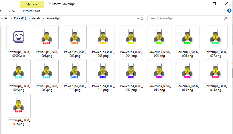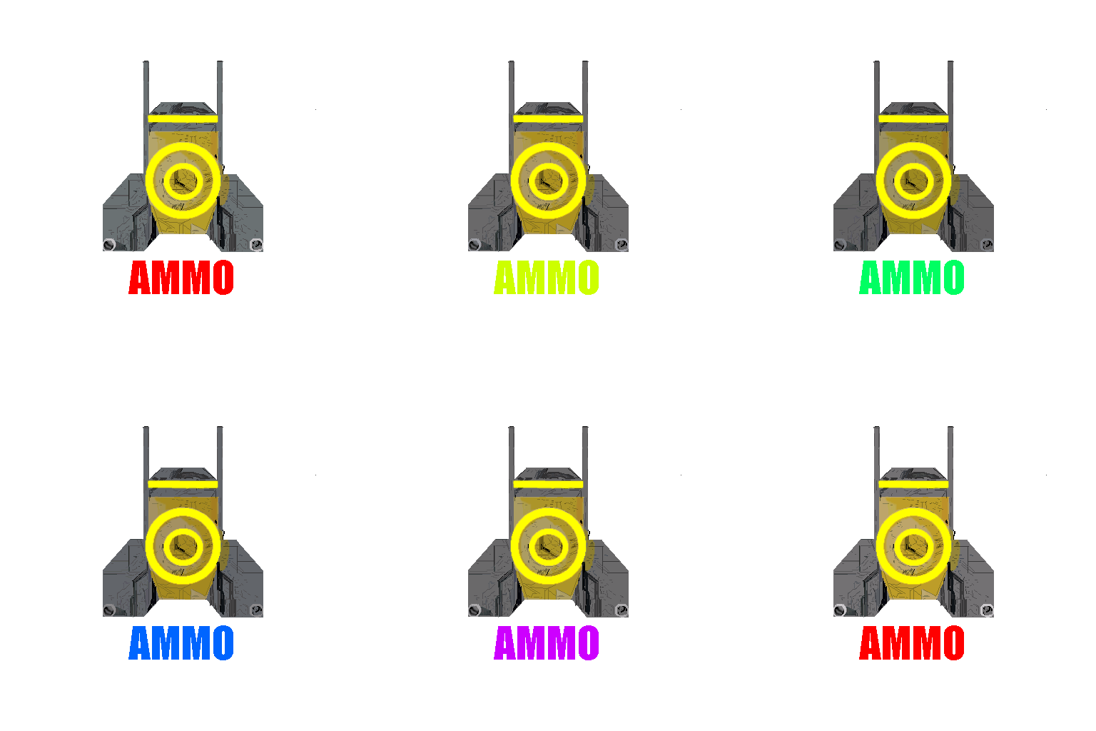

As mentioned in a previous post, I decided to delve into the world of making my own Sprites. Sprite is a term that goes back to the 70’s and standup arcade games and were implemented as hardware solutions. In today’s terms, it generally means a small, animated image implemented as a series of static files the sprite rotates through (Note: not a very scientific explanation, but that’s basically what it looks like to us who’s at home).
In our project we were given three sprites used for player powerups, but now, we need more. Rather than just getting new, pre-built sprites, we are going to create new ones in the same style as the ones we were already given (or as close as we can).
Although I used LibreSprite, it is very likely these same instructions will work with the parent product, Asperite. Installing LibreSprite is a matter of nothing more than downloading it and unzipping it somewhere. Then double click on the executable (at least on the Windows version).
Because the sprites I have are just a collection of png files, I really don’t have any way to edit them. My plan then is to cheat. I copied all the png files for the “Shield” powerup into a separate directory. I then loaded the first one into LibreSprite. When it asked if I wanted to load all the files I clicked “Agree.”
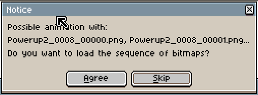
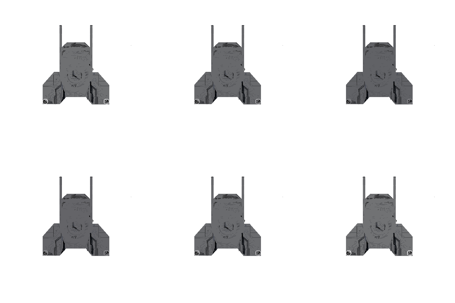
When you do, you should see something like this.
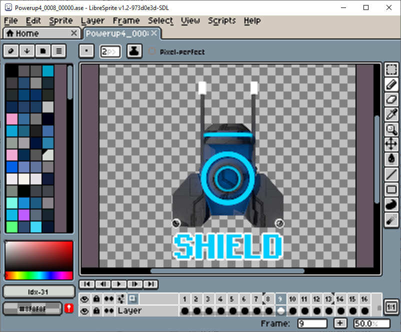
Now we are ready to start cheating. The short form of the plan is we are going to create a collection of new layers. In each of these layers, we will recreate some portion of the image. We will do this either by drawing or tracing the image we imported. When we are done and ready to generate our new sprite, we will simply turn off the reference layer and export it.
TaDaa!
The layers we will create are the following:
- Layer (reference) – This is the default one our reference image is stored in. This one will be disabled in the end, but left for future reference if needed
- Silhouette – This will be a simple grey background upon which all of our other parts will sit on top of
- Base Image – This will contain all the details and lines we will trace to give our power up some character. This part was frankly the hardest part for me
- Silhouette Animation – This will start as just a copy of the Silhouette layer. The key for this layer will be changing the opacity of each “cell”
- Target – This is the circle and bar part of sprite. It is the one that is a different color for each power up
- Shield – This is the background underneath the target and is the same color family as the Target. However, the opacity is changed to make it transparent
- Name Box – This will be the white border around the name of the power up
- Name – This will be the actual name of the power up
Special Note! I am writing this much after having done the work. It is possible I will miss a step and/or not remember why I did something. This is very much the “well, it worked for me…” version of this HowTo. I will try to list as many of the values and properties as I can so if it doesn’t work quite right for you, you can peruse the various properties looking for one that is different.
Silhouette
First, it is important to remember we are creating layers to separate the various parts of the image. Thus, you need to always be cognizant of which layer you are drawing on! As a safeguard, consider locking every layer except the one you are working on. This can be easily done from the Timeline view by clicking on the little padlock next to the layer’s name.
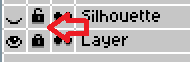
Notice above the layer named “Layer” is locked, while the layer named “Silhouette” is unlocked. Notice also the icon before that. “Layer” is visible, and “Silhouette” is currently hidden.
To create a new layer, select Layer -> New Layer from the top menu, or type Ctrl-Shift-N. Name it “Silhouette.” Lock the reference layer and make sure both layers are visible. Then, make sure the Silhouette layer is selected.

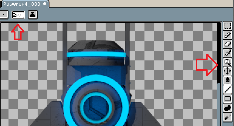
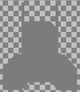
You are now ready to start drawing. Use your drawing tools on the right side to trace out the basic silhouette of our power up. You might consider making the pencil size a littler larger by setting it in the upper left corner. This will make it easier for you to connect lines so you can just use the paint bucket later to fill it in. You can use the eyedropper to help select the color you want. The layer you want to choose from does not have to be unlocked for the dropper to pick it up.
The current color will be displayed in the bottom left.
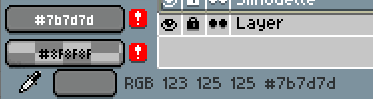
In this example, you can see the top box shows our current color as being #7b7d7d, which is RGB 123, 125, 125. When you are done, your silhouette should look something like this.
Base Image
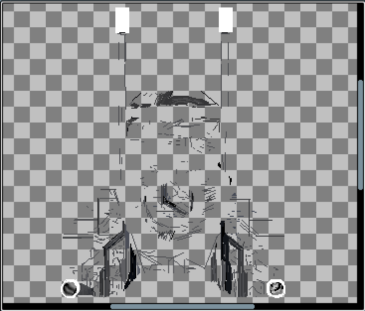
The Base Image layer is the chunkiest one in this whole process. Create a new layer, hide the Silhouette layer and show the reference layer. In this one, we are just going to mostly use the line tool to trace all the detail and texture of the power up image. This part pretty much sucks. I’m fairly certain the original artist had a cool background pattern he was able to just cut to the right shape and use. It kinda looks like an x-ray of pipes in a wall or something. But I could not find one close enough on the inter-web to just filch. As bad as this will look for now, it will be surprisingly close to the originals, at least to casual inspection (i.e. while playing the game). When finished, this layer will look something like this.
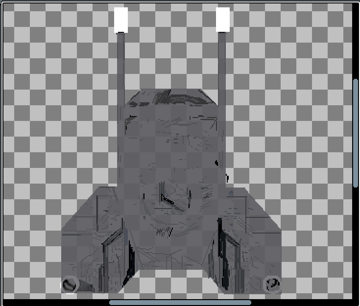
It might not look like much at first, but even adding just the Silhouette layer you can see it starting to take shape. But yes, this is the part where a real artist could do a much nicer job.
Silhouette Animation
This layer can be created by just duplicating the Silhouette layer. Right click on the Silhouette layer in the Timeline and select duplicate. Now here’s the tricky part. In the Timeline you’ll notice there are sixteen columns. This is because our original animation was composed of sixteen separate images. All we need to do for this layer, select the layer, then the right-click each cell and select “Properties.” The only property to change is the Opacity. Each cell will have a different opacity. It might take a little guessing initially, but then it is a math problem to figure out the value of each. In this case we set the opacity values in this order: 115, 135, 155, 175, 195, 215, 235, 255, 235, 215, 195, 175, 155, 135, 115, 95.
This next setting I don’t actually recall setting, and I don’t know anything about it yet. However, if you right click on the layer name in the TImeline and select properties, you can set the Mode to “Darken.” Like I said, this is something I need to research more.
To see what this does, you can press the play button at the top of the Timeline view. You can also enable the Silhouette and Base Image to see the effect.
Target
The target layer contains the color indicator for the power up. It consists of two circles and a bar above them. You can use the ellipse tool to create the circles. Again, using the reference layer to help position and size the circles. Select the ellipse tool, set the pen size and select the color. The tile board on the left allows you to select a color. You can tweak the color with the Edit Color Palette by pressing the Edit color button or using the F4 key.
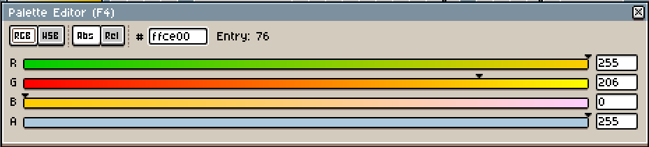
With the circles and bar drawn, we can jazz it up a bit using the blur tool. Select it from the toolbar on the right. Then, just brush it around the edges of the shapes we just drew. This will help enhance the flashing effect by making the edges less defined.
Shield
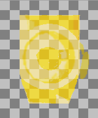
As with the other layers, hide all but the reference layer and trace out area and fill in with the chosen color. Use the blur tool to give it accents. Display the target layer to help decide where to blur. Right click on the layer name in the Timeline and select the Properties. Set Mode to “Overlay” and Opacity to “163.” I ended up with this.
Name Block
You will notice from reference layer, the text naming the power up has a white border on it. Not having the skills to decently create letters on the fly, I plan to use the built-in text tool. This of course will not get me the exact look and feel of the existing sprites, but hopefully we’ll get close. Of course, those fonts do not come with a nice white border. We’ll mimic this by putting a white box in its own layer and placing the text in a layer above it. We can then use the eraser and blurring tool to shape the white around it.
Name
We can add text by selecting File -> Insert Text. Be sure the layer you have selected is unlocked. Otherwise “Insert Text” will be greyed out. Otherwise, a dialog will appear.
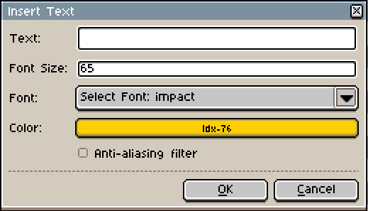
Here we can set the text properties. Anti-aliasing will smooth the letters a bit, though in this case I want to keep them blocky. Once you hit okay, the text will appear and can be positioned over the white box on the Name box layer. With both of these in place we can erase parts of the white box, so it frames the letters. We can also blur the edges of the letters. The end result is something like this.
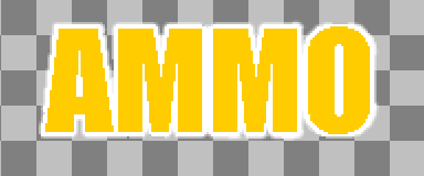
The final thing we need to do is change the color of our text in each cell. This is simple enough. In each cell we select a new color, then using the paint bucket tool, we click on each letter to change the color. If we want the same colors as the reference layer, we can use the eyedropper tool to set the color.
When everything is done, hide any layers not part of the final image. Then select File -> Save As. Change the file type to the preferred output type (png or jpg).
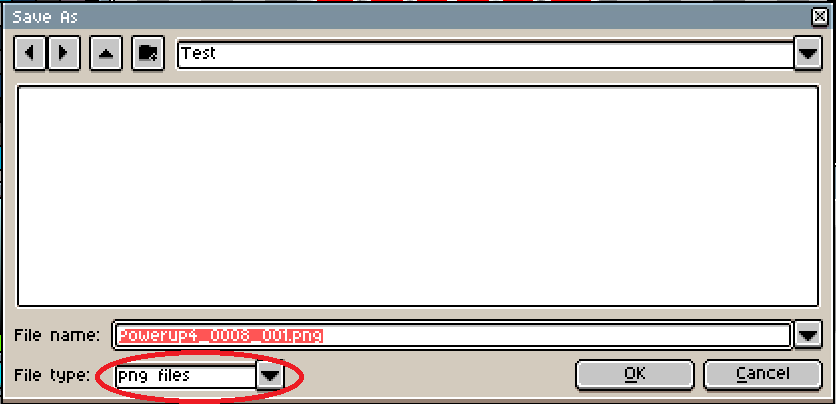
After being warned the target format does not support layers (thus the whole reason for this escapade) you will be if you want to save the animation as sixteen separate files. Select agree.
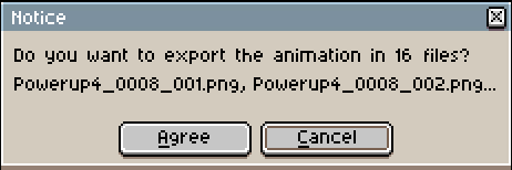
You now have a collection of files suitable for importing into Unity to create your animation.