
I decided it’s time for me to start creating some of my own art. Fortunately, it’s simple art. Or so I thought.
Originally, the theory was I would just take the artwork provided, copy it and change the colors and text. Which just shows how little I actually understand about creating computer art. So, before we get into it, let’s review a few things. For those of you who already know, this will be worthless and probably not exactly correct. For those of you confused like me, I am hoping this will make more sense to you and provide you the answers I couldn’t find.
First, I needed a tool. There are some obvious heavy hitters available to us. Gimp, Inkscape and Krita are free, open-source powerhouses. However, unless you are already well versed in these tools, they are insane overkill for this particular task. If you’re already well versed in these tools, you don’t need this blog post.
The one thing these three solutions do have is the right price tag. aka free. When you are running on a budget of “unemployed” this is very important. Even small price tags can add up if they don’t do what I need. And, as we will quickly see, I don’t know even enough to ask the right questions, let alone ascertain the right answers.
I know I wanted something simple in the Windows Paint sort of way. After much searching, I stumbled upon Aseprite. Even at just under \$20, since I didn’t understand what I wanted, I didn’t know if it would do what I wanted. Fortunately, I ended up stumbling upon LibreSprite. LibreSprite is a free and Open-Source fork of Aseprite and as such met the price requirements. From the FWIW department, I’m now convinced the \$20 price tag on Aseprite would have been worth it. I’ve also since seen it is a well-known and common solution for many. I just didn’t know that at the time. What I still can’t answer at this time is whether or not the \$20 for Aseprite is worth choosing it over the free LibreSprite. All I know for now is LibreSprite did what I needed and therefore assume it’s parent product would do the same.
The next bit of knowledge I collided with had to do with how images are created on a computer. Without diverging too much, the metaphor or motif used is the same used in animation. Each image is actually a collection of transparent layers. This allows the artist to work with different parts of the image without mucking up the rest. This is particularly useful when you want to animate the image. By working with layers, we only need to modify the layer that changes.
Unfortunately, none of the common image formats we encounter these days support layers. Whenever we save an image as a jpeg, png or most any other we commonly encounter the layers are squashed down into a single one. What this means to me is those awesome sprites I already have, which are saved as a collection of png files are of no use to me for making new ones. In other words, my plan to just edit these files was seriously flawed from the get-go.
Clearly, I needed a new plan.
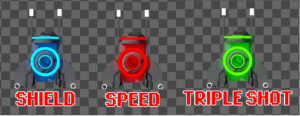
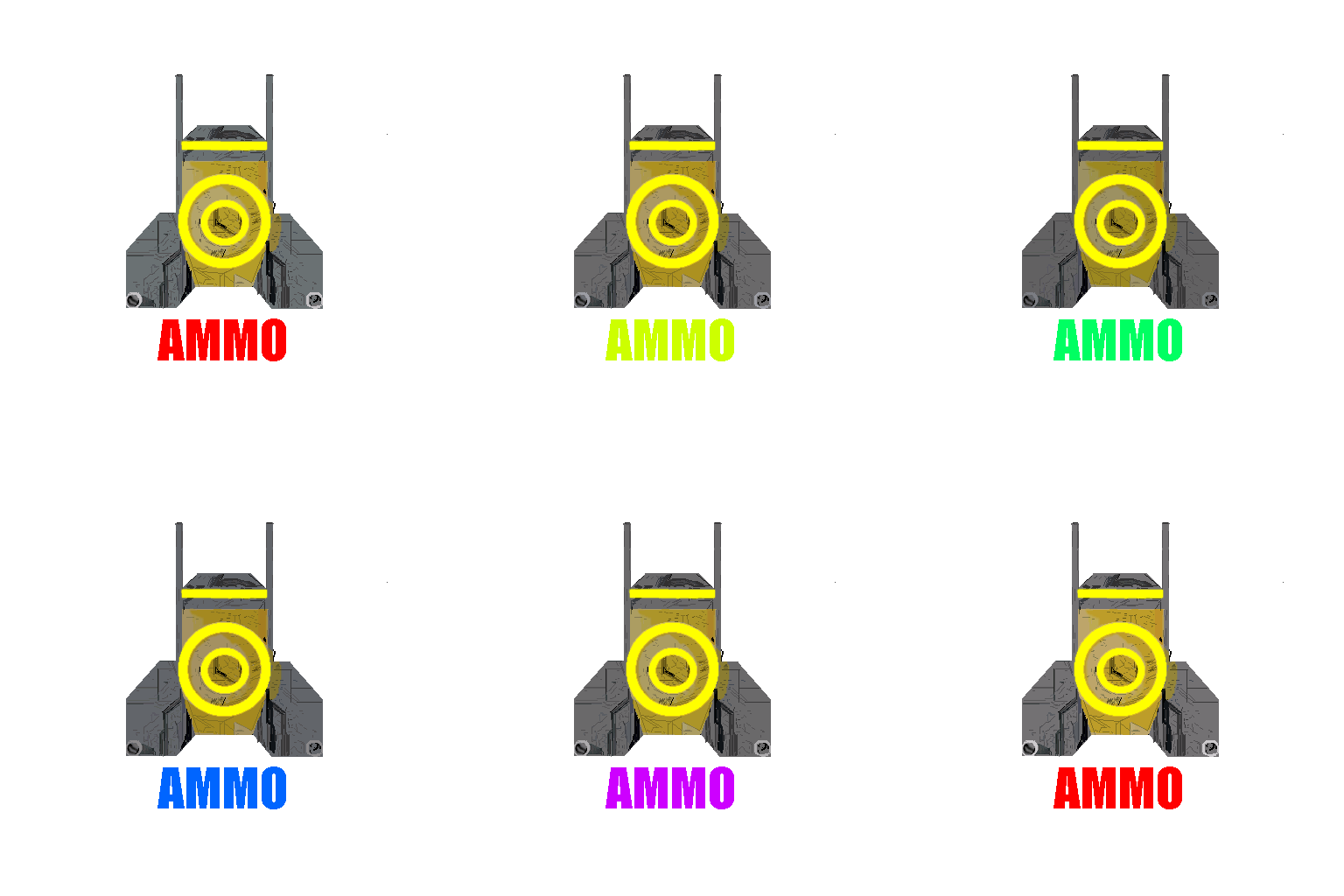
I’ll admit, I was beginning to wish I had just opted to look for free ready-made assets. But no, it just meant I was going to have to learn more than I wanted. I started by more closely examining the images I wanted to duplicate. Each power up used the same design. The only difference was the text denoting what power up it was below the image and the primary color. As I said, conceptually, all I wanted to do was change the color and the text. Unfortunately, (it might not be obvious from the image) the color I need to change is not just a simple, solid color. The blue part of the shield power up is many shades of blue. While this looks lovely on the screen, it means I can’t just do the little paint bucket thing to change the color. And the text isn’t really text. So, I’d have to brush it all away and then paint it back.
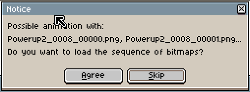
I realized needed to take a closer look at the images to see precisely what I was dealing with. I downloaded LibreSprite, unzipped it and fired it up. I was almost instantly rewarded with some new insight. LibreSprite is a purpose made tool. As such, it “knows” things. When I told it to open the first file (Powerup2_0008_00000.png) it immediately recognized this file as a potential part of an animation series. So, it asked me if I wanted to load the entire series.
Hitting “Agree” and letting LibreSprite load up the whole directory of files turned out to be surprisingly useful. By opening the “Timeline” view, I was able to loop through the images as fast or slow as I wanted. This yielded some surprising revelations.
Now, it’s a little hard to see when moving at full speed, but once you put it into LibreSprite and step through it you will start to notice things.
First and easiest, the text animation is nothing more than rotating through a series of colors.
Second, and less obvious, the color part, what I later called the target and shield layers actually are NOT changing.
Third and even less obvious, the grey base image is ALSO not changing!
So, what is happening to make it look like it is flashing? Cleverly, there is ANOTHER layer. It is the same size as the grey, base image. It is also grey. However, on each cell we change the opacity. By rotating from light to dark and back to light, this layer makes the entire image appear to flash.
The final trick is in the ordering of the layers. We put the “animating” layer above the grey base image and below the yellow elements. In this way, the base image gets slightly “greyed out” by the animating layer. The yellow layers however are affected only indirectly by darkening the layers below it.
In my next post, we’ll walk through the details of how to do all of this.